Case Study — LA Hacks 2023
Shaping an easy and fun application experience to Southern California’s largest Hackathon
PROJECT OVERVIEW
TEAM
Katherine Wang
Amie Xu
Maxine Romualdez
Taylor Che
ROLE
Product Designer
TIMELINE
September 2022 - June 2023 (9 months)
TASK
Design three sites, a mailing site, an application site, and a live hackathon site for 10,000+ users worldwide for the first in-person hackathon in three years. We created all graphic assets and components according to our theme “coming home,” mapping out all user flows for an engaging yet seamless experience.
BACKGROUND
Changing the narrative towards a more inclusive and less intimidating hackathon with graphic assets.
Hackathon sites are often daunting, convoluted or just boring to navigate— and we felt our site did not represent the mission of our hackathon accurately. We wanted to encapsulate the significance and excitement of our first hackathon in three years in a fun, and engaging way. Hackathons are meant to enable all students, no matter their background or experience, to turn their ideas into a reality— and we wanted our site to reflect that.
USER RESEARCH
Targeting high school and college students
The main users or applicants are high school and college students who have an interest in technology. We relied on feedback from past hackathons and our own experiences as current students, to gather user pain points and characteristics.
We drew 3 key characteristics/priorities from interviews with hackathon veterans, first-time interested attendees, and people with no knowledge of hackathons:
01. Saving time and streamlining the application process
Applicants value a streamlined application with an easy and painless flow, increasing the likelihood of submitting an application. Hence, it was especially important for us to create a site that did not overwhelm the user with unnecessary information and steps.
02. What differentiates LA Hacks from any other hackathon?
LA Hacks fosters creativity through interdisciplinary collaboration, mentorship, workshops, and networking, creating a lasting impact on participants. We wanted people to know this about LA Hacks, and emphasize our value.
03. Overall visual aesthetic and branding of a hackathon site
Students and hackers will judge a website by its face value. Thus, it was incredibly important for us to create a visual aesthetic that reflected the values of LA Hacks.
GOALS
Our 2022-2023 Instagram feed
01. Encourage more interested students to submit their applications
Create a fun while usable experience, while designing to our theme. We aimed to create a design system and illustration that supported a message of being accessible to all regardless of skill level. Hackathons are daunting, and we wanted our design de-intimidate potential users.
02. Increase attention to relevant information for potential sponsors
LA Hacks costs $150,000 to run in its entirety, including booking the venue, wifi costs, and transportation (to name a few items). A large part of running the event are potential sponsors, who view our site and make a decision to sponsor us based off our site.
→ How do these three insights translate to project objectives?
01. Maximize opportunities for application entry points in most sections of the site.
In order to create a site where applicants could save the most time applying, we wanted to put multiple points on the site where a user could enter the application flow.
02. Information about the hackathon placed immediately upon site entry
In order to communicate the value of LA Hacks as opposed to any other hackathon, we wanted to put striking statistics about our organization on the initial user flow. If a user couldn’t see the value of LA Hacks, then why would they even bother to apply?
03. Coming home themed graphics, additional illustrations and bright colors
We wanted to set apart LA Hacks from other hackathons, and we wanted to do that visually. In order to create a vibe in which beginner hackers felt comfortable applying to, our goal was to create playful illustrations.
IDEATION
→ How could we maximize hackathon applications through our site structure?
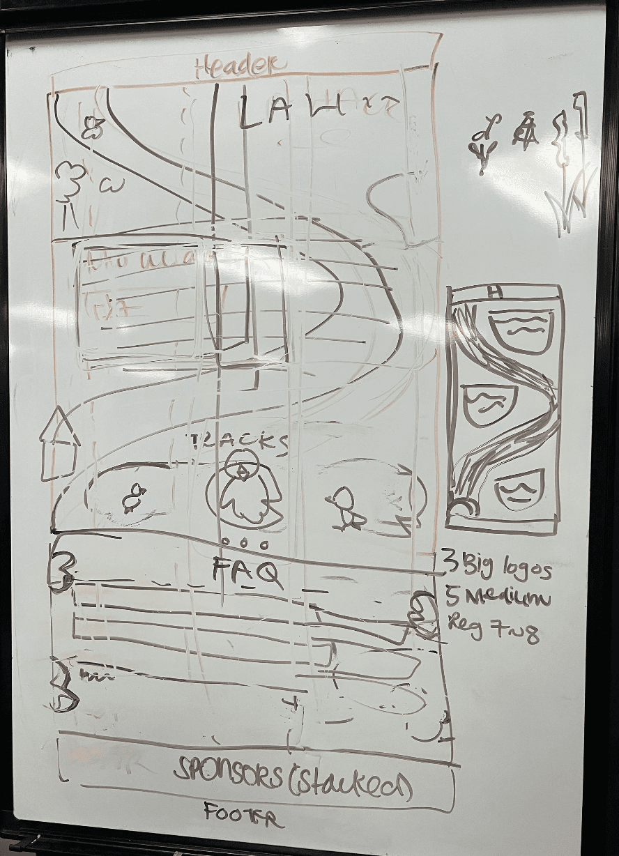
ϟ Initial ideation: Making the site layout one continuous flow from the initial entrypoint, as opposed to having subpages.
With the information for the site (about, hackathon tracks, FAQ) on the main page, we decided to have the application flow be independent of this. We were sure to add many user entry points to the application at any point within the site.
From our user interviews, we gathered that hackathon applicants sought less clutter in an application site. Potential applicants quickly wanted to browse through relevant information without having to navigate multiple flows.
→ Additionally, how do we maximize engagement with the user application flow?
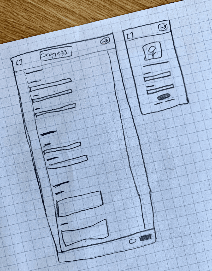
ϟ Initial ideation: Keep the user form short and simple, with users being able to save progress.
We wanted the application to be short, and minimize friction. We decided not to go with any pop-up user signups, and defaulted to a separate sign up page.
Now, we needed to consider the post-application submission user flow.
After considering the way we wanted to structure the application page, we needed to plan out the flow of the application post-submission.
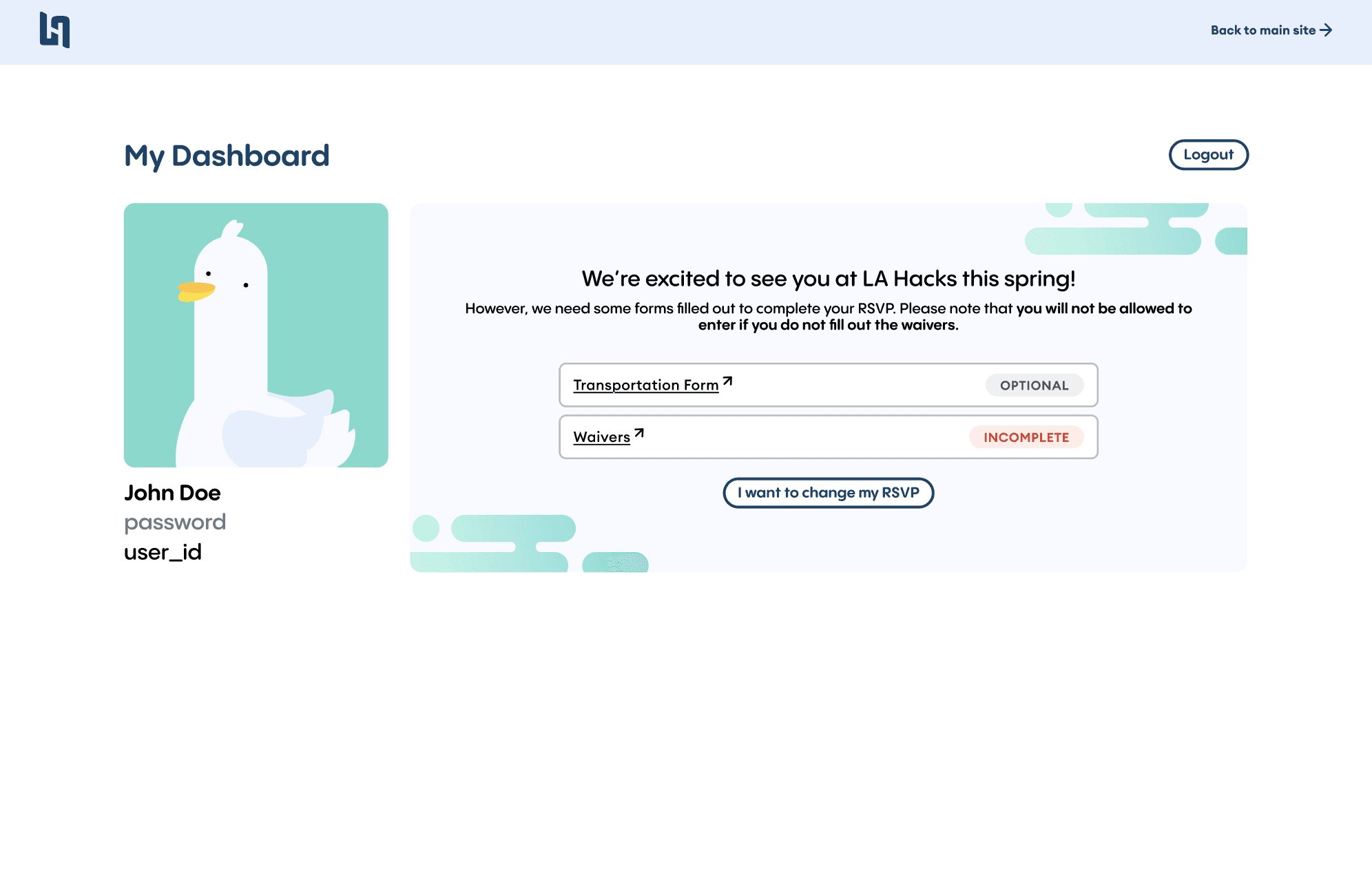
Working with our development team, we needed to consider the backend processes in addition to the form design. We needed to communicate to the development team the processes that we wanted users to take in the flow. The flow details what should happen if they do not succeed correctly with login credentials, and what will happen if a user is rejected or accepted once submitting the form.
Aside from deciding the most efficient application flow, we created components and styling for the form.
It was key to develop different states for forms, as well as uniform text and grid styling. Most were created by us, but some were taken from the MUI React library for ease of development.
Our UI components created in Figma documentation
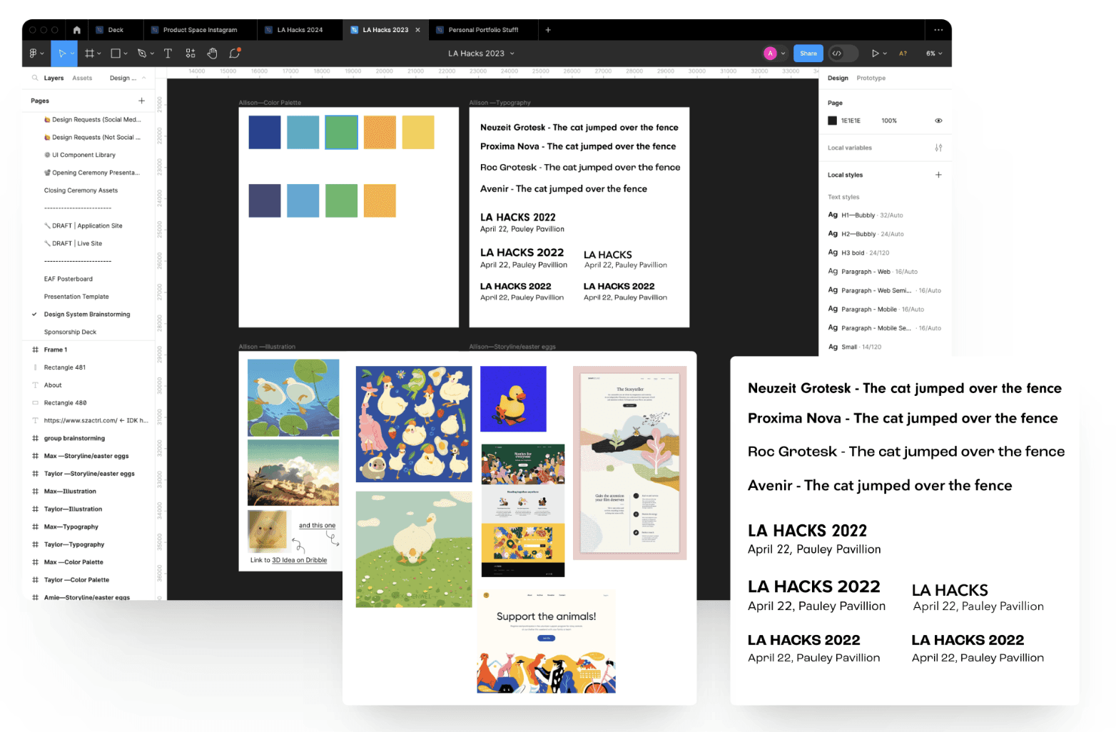
We consolidated other choices on text styles, color styles and illustration styles.
Below were some assets we pulled for our preliminary inspiration. It was key for us to find a perfect combination that fit the theme of “coming home” to the first hackathon in four years. We wanted to find something that was invigorating and exciting to look at.
Our inspiration board within our Figma file.
DEVELOPING STYLE
Experimenting with isometric styles for a fun, yet tech-like feel.
A lot of of our site users come from people who are considering applying to the hackathon, and our site is their first impression of our event. It is crucial to make the visual design something fun, and meaningful yet relevant to the tech sphere.
We opted for an isometric style because of its use in modern design, with its clean feel that wasn’t overwhelmingly life-like.
DEVELOPING WIREFRAMES
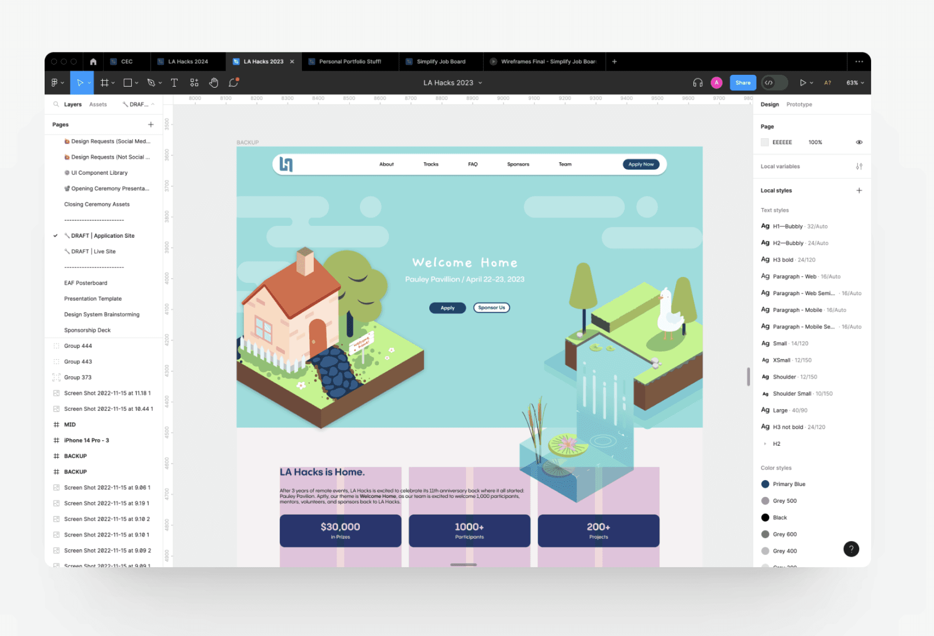
Preliminary versions of our designs included deciding upon a grid system, spacing, and color stylers for our illustrations.
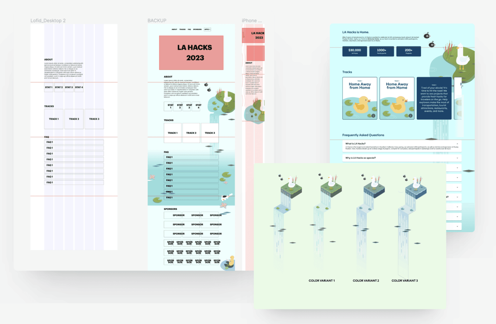
After coordinating with our executives on what information to include on the site, we were able to decide between a 3 column grid and a 4 column grid. We ultimately ended up choosing the 4 column, which you can see multiple iterations of below.
We planned each element out with Figma autolayout, and built our components from the bare bones of the lofi wireframe, to increasing fidelity while debating between versions of styling.
Progression of our site, from lofi to hifi wireframes.
TESTING AND VALIDATION
Our “bug bash” site, where we evaluated and categorized site changes.
Creating methods to manage bugs and re-evaluate site structure.
We developed a bug tracking system, in order to find any errors or anything that inhibited user flow through the application. Through testing with our entire LA Hacks committee, we got an unbiased view of user pain points that we could address through making different design iterations.
Perfecting our user application flow for a seamless applying experience.
We expanded on the previous user flow diagram from above, and we made a hi-fi version of it.
It was important to create thorough documentation for our developer team, as highlighted in this example. We needed to take our plans from the abstract into the hifi wireframes, being sure to account for each edge case and fields required for each point in the flow.
KEY DECISIONS
✳ Isometric design styles created a fun, fresh feel
We ran with the isometric style because it provided a feeling that was playful yet balanced out our illustrations. At the end of the days, these illustrations are for a hackathon so we wanted to pay some homage to that. Our illustrations and bright color palette we chose hopefully created a site feel that was not intimidating or daunting for those wanting to apply to their first hackathon.
✳ Integrate a separate flow for the application, as opposed to embedding it all in the initial landing page
We decided to reserve the initial landing page solely for information, in order to draw the user into the main value points of our hackathon. We hypothesized that in order for the user to find any value in our hackathon, they need to consume information about it before navigating elsewhere.
FINAL DESIGNS
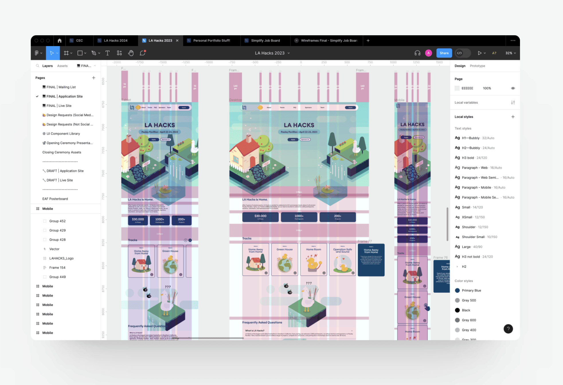
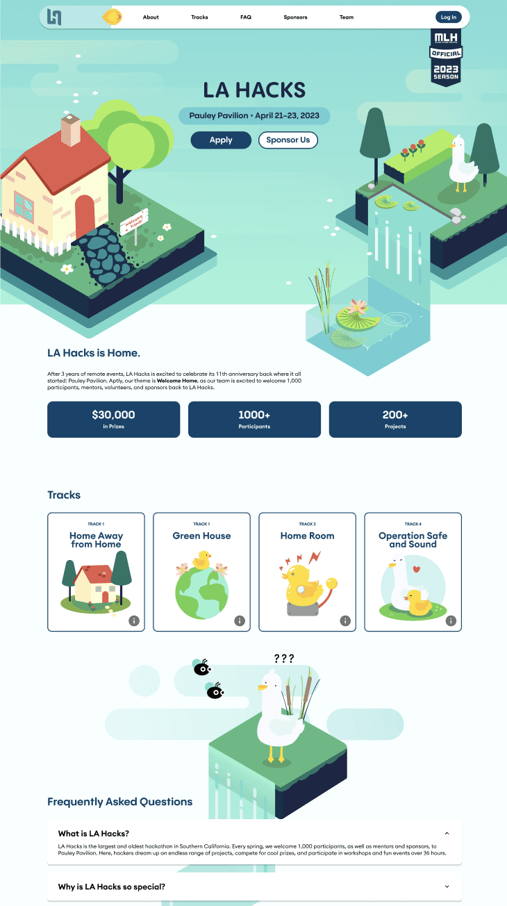
A site flow that encapsulated key information about LA Hacks, not overwhelming the user with initial application content and logistics.
We worked to create an engaging site experience that was not only fun to look at, but contained relevant information to users.
A collection of site screens, from mobile breakpoints, tablet, and desktop
IMPACT
Managed an application site with over a 10,000 user base
Received over 2000 applications for LA Hacks 2023
Throughout the process even after deployment, we worked to post updated information on the site whenever required by the team. The user base included UCLA students, students nationwide from different campuses, as well as international students.
KEY TAKEAWAYS
✳ Documentation for your designs is critical
Especially working with a development team, it is even more important to document information in the Figma. Whether that be creating components for styling, cards, or illustrations, this project taught me how to document designs in a way that made sense for others to follow.
✳ Perfection makes a design so much better
This project also taught me to not settle. In a culture of deadlines, I find that it can be easy to just finish a design for the sake of a deadline. I learned that yes, deadlines are very important, but also that great designs don’t come from one iteration. I learned what it meant to constantly improve version after version of my designs.
✳ Test, test, test!
I learned the importance of having diverse testers for a site. I found that when testing our application with cold users, this was the most effective way of finding errors in our site that I may not have found otherwise.
APPENDIX
Designs for our social media, check out our Instagram!
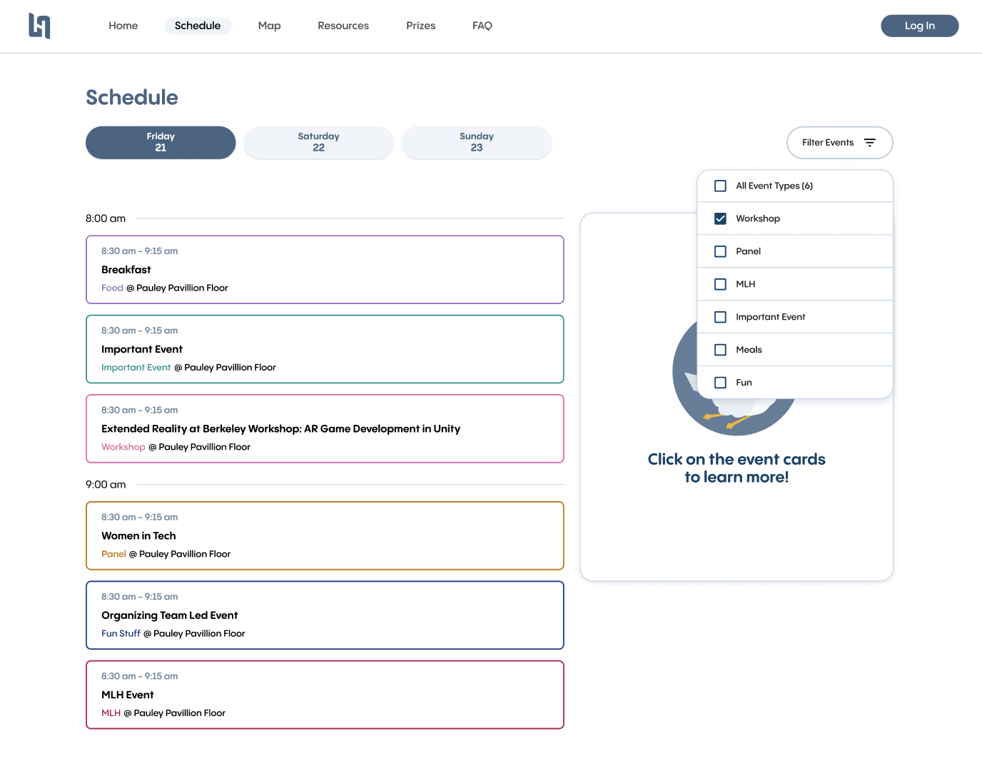
A few screens of the live site (hacker information source during hackathon)
Photos of the event in Pauley Pavilion, including LED boards designs!
❤ Thanks to my design team!
Designing for the largest hackathon in Southern California is a scary feat, but my design team lead Katherine made it so much better. Thank you to Max, Amie, Taylor and Grace for working with me, giving me ideas and helping me grow so much in every aspect of design. Whether it be Figma stuff, Adobe Illustrator, or After Effects, I learned so much. Thank you!